Stopwords in Voice UX

For the holiday season this time, I gifted my brother Google Home Mini. He uses the Google Now results very often to gauge traffic, weather and keep track of his calendar, so it made a sensible gift for him. Google, being Google, had added its own playfulness to this device. One such instance was the option to play family trivia. Very excitedly we divided ourselves into teams and settled down to play the quiz with Google being our quizmaster. While we were in the middle of the game, my father received a phone call which needed us to stop the game. This is where the experience which we were loving until that point, went downhill and very fast. It took us ten minutes of pleading/ yelling at Google to stop the game until my nephew stood up and unplugged the device.

It is then that I realized how important it is for experiences to be deferential to the user. The navigation flow should allow the user to exit the system whenever the user wishes so that the user doesn’t feel trapped. Consider your smartphone, it always has a back arrow in the bottom navigation bar, should you feel like exiting the application. Similarly, in your desktop, the website has a top-bar which allows you to navigate within that system and so does the browser, for cases when the website stops responding to your command. So, there exist two options for navigation – one within the application you are using and one in the operating system. If we apply similar concepts to voice commands, the Google home should have a navigation system of its own and so should the Family trivia game. Google has done a good job of making the user understand that ‘Hey Google’ is a ‘keyword’ (as defined for coding languages). These words when used together will always mean that you want to invoke a certain response from the system. We should extend this list to include ‘breakwords’: phrases such as ‘terminate now’ which can be used to stop the current action.

This is one of the first steps in navigation for voice user experience and there are many more aspects to consider, such as jumping between applications, to make the experience equivalent to current digital experiences, if not better.

Paper Prototyping: Unicorn Bubble Tea

Today I created and tested my first paper prototype. We ( me and my other two team members) spent three hours with glue, sticky notes, chart paper, colored pencils and other office supplies to create a working prototype for Unicorn Tea Bubbles, which serves bubble tea of different flavors and customisations.

We started out by determining our platform – did we want this to be an application stored on the user’s phone or would it be a tablet installed in a kiosk at the shop. This would affect a lot of interactions such as storing favorite drinks and personalization of the application. We decided to build for a kiosk as none of us had worked with a public interface before.

The next step was to identify the set of tasks that the user might want to enact.

  1. Select a pre-built drink
  2. Build his/her own drink
  3. Change quantity of drink
  4. Add more drinks to the order
  5. Pay for drink
  6. Add tip

This task list guided our sketches of the interface. We worked out what information would be present on which screen, followed by the sequence of the screens. This forced us to think about navigation – should it be forced ( where the user can go only back and forward) or free flowing? Since the interface we were designing was exploratory ( the flavors would appear only on the flavors screen and not beforehand) we decided to do a mixture of free-flowing and forced.  We added a ‘Next’ and ‘Back’ button, in addition to the button for ‘Cart’ and ‘Home’.

It was then time to design the visual aesthetics and proportions for each screen. Keeping the fun, light, playful theme of the company in mind, we decided to add animation to the screen (the cup fills with a different color at each section depending on selection, see picture below).

Once we had decided the screen layouts, we built the paper prototypes and tested it out on three users. The process involved giving them a specific task of ordering a tea with x flavor, y bubbles, z size. We split the team into facilitator, observer, and helper. I played the role of the observer.

All three users forgot to press the ‘Next’ button, often waiting for the screen to change on its own. This is probably a result of our conditioning as users when screens ‘understand’ when to change. The second point we observed was an issue with the wording ‘Customize your drink’. The task listed it as ‘build your own drink’ so non-native speakers had difficulty in identifying the correct button. A more glaring gap we discovered during this exercise was that we didn’t offer any method of editing a drink. The user had to delete the current drink and rebuild the entire order.

Thus, we ended up discovering feature gaps, wording confusion and navigation problems in addition to small changes suggested by our users.

This whole exercise helped me understand the value of reiteration. We iterated over our design after each test users and we could still come up with new flaws in our design with the next user. The flaws did become smaller and finer over the course. Thus, we constantly improved our design.

I wonder how many testers are too many though? At what point do the changes stop becoming improvement and start becoming personalization? Also, should the suggestion be weighted by the number of users who suggested them? If everyone has a problem with an element then it needs to change but what if only 30% of the people have a problem? I guess I’ll know this with practice!

Link to the videoScreen Shot 2017-11-07 at 10.19.38 PMScreen Shot 2017-11-07 at 10.20.04 PMScreen Shot 2017-11-07 at 10.20.32 PM


Inktober 2017 | You can draw in 30 days

Happy October everyone!

My Instagram feed is full of beautiful ink drawings drawn by people around me (#inktober2017). They vary from thought-provoking sketches to quick captures of the surroundings. It makes me want to draw and be a part of this, but then I remember how poor I am at sketching. Honestly, my stick figures look like a bunch of lines drawn randomly across the page. So I’ve decided to let all this creativity around motivate me to learn to draw! I picked up the ‘Learn to Draw in 30 days’ book by Mark Kistler. I’m going to set aside 20 minutes everyday from my never-ending grad-school schedule and learn to sketch! I will be posting my progress here. Wish me luck 🙂

Here is a link to the book in case you want to join me.

Update: I’ve finished three days of this. I wish he used reference lines sooner though!


This slideshow requires JavaScript.

Re-design for Accessibility: iPhone headphones

While studying introduction to interaction design, our task was to re-design the iPhone headphones. Our team of four broke down this task into subparts and proceeded as follows.

Not everyone was familiar with the product, so we took out a sample and examined it thoroughly. We then went ahead and listed some common problems faced by the users:

  1. Tangling- headphones get tangled very easily when they are stored owing to the multiple wire parts and length of each
  2. Maintenance – The apple headphones have a peculiar earbud shape making them extremely difficult to clean. As a result of this, dirt gets accumulated in crevices. Owing to their color white, they get dirty easily.
  3. Lack of grip – a lot of us complained about these headphones falling off when we went running, this is due to their loose fit (one size fits all).
  4. Symbols/ markings – The headphones have a play, pause, forward, backward, volume controls left and right, however, not all of these are printed on the headphones.

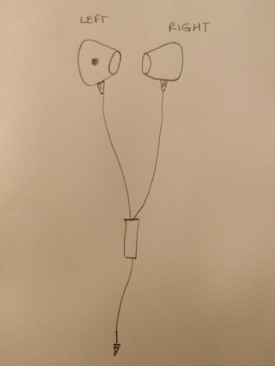
During this brainstorming exercise, we realized that a major problem of lack of markings can be solved very easily. So we went ahead and looked at each function and the corresponding symbol in detail. There were light gray ‘L’ and ‘R’ markings to identify the left and right earbuds. But these were worn off on one sample earphone. This lead us to question the scenario where these markings were absent – say for visually impaired people or the larger audience who uses these earphones in the dark.

IMG_20170921_212737.jpg

The solution was fairly simple, we added a raised dot, much like in braille, on the left earphone. Tactile feedback is a great source when our vision fails, like in the dark room. The user can easily feel the dot and know which bud goes into which ear, thus making these earphones accessible to a larger audience. Another solution that emerged was applying glow in the dark paint to the left ear. However, we thought about the brand image of Apple and it’s repeated focus on simplicity and thus decided to use the braille-raised dot approach over this.


Team: Ruchi Ookalkar, Pallavi Benawri, Sonali Tandon, Huyan Phan


UX in advertisements: language

When I was a child, I would run to the television screen during the ads break and go away to play when the program started. For the mini-me, the ads were the program. I’m one of those weird people who don’t have ad-blockers installed on all my platforms, much to the bewilderment of my friends. See, being able to tell a story in 10/30 seconds, much less convince someone to act on this story is amazing. And advertisements, try to achieve this very difficult feat. Every time I watch an ad, I am awed by the visuals and sounds placed in perfect sequence so as to convince me that I need a particular brand of jam or shampoo in my life.

Now picture this, you’re watching a very compelling video film that is trying to convince you to buy ‘product xyz’, except you cannot understand what they’re saying. Not because they’ve done a bad job at making the film, but because it’s in a language you do not understand! Not only will that leave you frustrated at the loss to cherish a well made clip, but also annoyed that someone expected you to know a non-universal language. This is my precise feeling when I go to YouTube. My beloved service, assumes I know Kannada, since I’m based out of Bangalore. While the native language of this region is Kannada, I being a migrant, like thousands other in this silicon valley of India, do not understand this native language. So when the advertisement tries to convince me to buy ‘product xyz’ in Kannada, it actually does the opposite.

You might ask, how else will YouTube know which language to sell you products in? Afterall, it isn’t entirely stupid to assume you know the language of the region you’re living in! There lies a very simple solution. YouTube, and other such content providers, know the content I’m consuming. So, they know which language my content is written/spoken in. Thus, showing an English ad to person who is watching a video in English and a Kannada ad to a person who is watching a Kannada video is as simple as it gets, leading to a (marginally ?)happier ad viewer.

Choropleth Map Project

I’ve been fascinated with choropleth maps for a long time now. Choropleth maps for the uninitiated are maps which have various areas coloured according to a particular value. The gradation in shades shows the gradation of the value. Sort of like a heat map. I love how easy these are to read and how well they communicate the data contained in a short span of time. These maps take advantage of the fact that human eyes are very sensitive to colours and change of colours.

I come from Vidarbha, an area which repeatedly suffers low rainfall. Being majority agrarian, the low rainfall results in poor harvest. This in turn leads to inability of paying back debt for the farmer. A large number of farmers every year succumb to this pressure and commit suicide. I was curious to see whether this was an issue faced in my area only or whether it was a problem spread over the country ( agriculture is our biggest employer). I am also aware that this problem has existed for a long time now. So I wanted to see if the problem had reduced over time, with repeated attention being drawn to it every monsoon end, year on year.

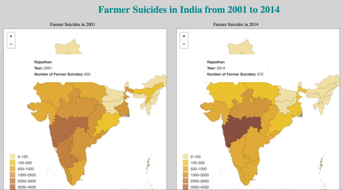
So I drew up a choropleth map of India showing the number of suicides. I made two maps, one for 2001 and one for 2014 and allowed comparison between the years for a particular state on mouse hover. Sadly, the number of suicides is highest in Maharashtra across the country in both these years. What is more shocking is that while the number has reduced in other states, more farmers are committing suicide in 2014 than that in 2001 Maharashtra.You can find the visualisation here. (Edit: this visualisation has been moved to make space for my portfolio. Please contact me if you’d like to take a look)

As you must have noticed, it takes a considerable while to display the maps. This is due the geoJSON files being used to draw the map. The files are 16MB+ and thus take time to load. I tried using topojson files to draw my map (topojson files are usually half the size of geojson) but the topojson file has only coordinates. It does not contain state names or any other identifier for which state the coordinates correspond to. So, the file does not work while creating a choropleth. I am still looking for a better alternative to geoJSON, but for now, I hope you enjoy the viz 🙂

Think Small: Microinteractions

You’ve worked a toaster before right? You put the toast in, press a button and a few minutes later a crisp toast comes out that you can enjoy with butter. Well, that is an example of an appliance based on a microinteraction. Microinteractions are contained product moments that revolve around a single use case—they have one main task. I recently finished reading Dan Saffer’s Microinteractions: Designing with Details. The book defines the structure of a microinteraction and how all the elements work together. The structure is:

  1. Trigger: Something that sets off the microinteraction . This could be manual i.e generated by a user need such as “I need to check the time so I will open the alarm app” or it could be system generated i.e “It is 5:00 am hence the alarm will ring”.
  2. Rules: These define how a microinteraction behaves in various situations. An easy way to deal with the rules is to draw a flow diagram. This prevents errors.
  3. Feedback: These make the rules evident to the user. The cursor turning grey when it hovers over an un-clickable button tells the user that the button is not available.
  4. Loops and Modes: A microinteraction can go into a loop, for example, “snooze every five minutes until the alarm is turned off”. It can also have modes where the user can adjust settings. It is preferred to have a separate screen for the modes.

One key thing that Saffer talks about is bringing the data forward. He motivates you as a designer to not begin from zero. You are aware of things like the operating system, the time of the day, location, past use behaviour patterns and trends. These can be used to set smart defaults and predict future user behaviour thus making it a much more delightful experience for the user. For example, if I set an alarm for 5 am everyday and I forget to set it one day, the app should point out and remind me that I haven’t set my alarm. This is leveraging my repeated predictable behaviour to make the app more useful.

LittleBigDetails is a website that curates microinteractions. It is like a treasure chest to observe how various companies have implemented these ideas to bring a smile to the user 🙂

screen-shot-2016-10-18-at-4-03-19-pm

Reference : http://microinteractions.com/what-is-a-microinteraction/


GenderFuck (Game Design)

Remember when you were a kid and used your fingers to count? Or when you had to cut out shapes from coloured paper in math class? You were using “objects to think with”. Papert came up with this theory that explains how we intuitively use objects to drive and aid our thought processes without realising that we use them.

GenderFuck is a New Liberal Arts topic which deals with gender fluidity. It dictates that all stage from man to woman to in-between and no gender are all available to a person today. I wanted to create an “object to think with” which would instigate the person to think about GenderFuck. For me personally, the concept of GenderFuck deals with a choice. And as with all choices, information is key. I should be aware of all the positives and negatives attached with the group I am choosing. Hence, I came up with a game which will subtly edge the player towards thinking about gender differences and prejudices which exist within society.

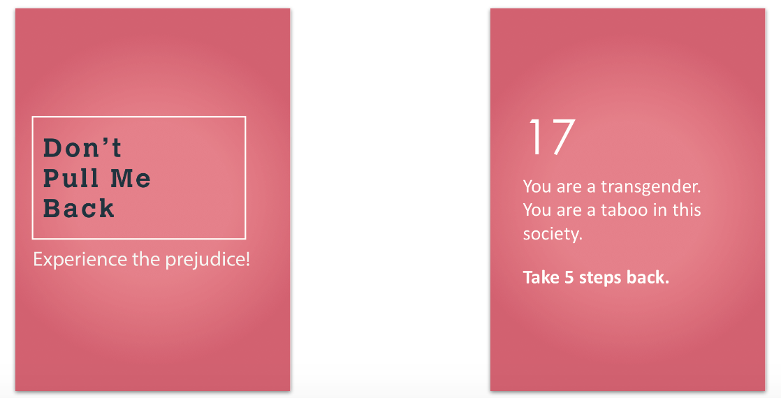
The prejudices faced by men, women and transgenders were crowd sourced using various social media platforms. The responses achieved were surprisingly similar across countries. Each prejudice was then categorised as being “harmful” or “helpful” to a particular group. Weight was then attached to each prejudice based on the impact it creates in society. Prejudices such as female foeticide are obviously more serious than ladies first.

The game was tested on two user groups. The first group knew the purpose of the activity and the concept of “objects to think with”. The second group was a bunch of 1st year students. Both groups enjoyed the game play and that a our major victory point. Some prejudices invoked stronger reactions than others, like in society. All in all, it made them think about gender differences.

This slideshow requires JavaScript.


Local History

As part of the Instruction Design course, we were required to create a lesson plan and corresponding student activity sheets for a local history lesson. The task was to pick a local place and take the kids through the history of that place using constructivist strategies.

I chose to also teach kids the tools used in uncovering history which can be applied to any monument /event/person they encounter.

They start with listening to tales told by elders. This will make them aware of existing stories around a place. The children then look for articles about the place and answer a set of questions using these articles. This teaches them the importance of evidence and how events shouldn’t be taken at hearsay value. It will also teach them how to analyse existing matter to read a story. In the field trip, the children will sketch the peculiar architecture and note down the vows that are special to the place. Note taking is an important process in recording history and it emphasises that a good historian is a good observer. Finally, the children take home pictures from the trip and create a story with these photographs. In essence, they are recording their own version of history and leaving it for future generations to live.

The kit includes the following:

Teacher’s lesson guide

Teacher’s lesson plan

Student Activity Sheets